Assignments > Lab 5. CSS Grid, Flex, and Responsive UI
Due on Fri, 04/30 @ 11:59PM. 5 Points.
CSS is notoriously a nightmare – particularly when it comes to layouts. As an effort to help you learn to of the modern techniques for layout doing page layouts – CSS Grid and Flexbox – the course staff and I have created two exercises to guide you through the process.
Please complete the readings listed below. Then complete the two activities:
Readings: Before you come to lab
Before you come to lab this week, please make sure you have reviewed the CSS techniques you’ll be using in lab – particularly the required readings noted below:
1. CSS Grid Readings
CSS Grid is a technique that allows you to assign containers to specific places on your web page. Front-end developers tend to use CSS Grid for the main layout of a page (i.e. to position navigation, main content, sidebar, etc.).
The following 2 articles (required) will guide you through the CSS Grid ideas covered in part 1 of today’s lab:
- required Learn CSS Grid in 5 minutes - A tutorial for beginners
- required Introducing Grid Template Areas
If you want a more comprehensive look at CSS Grid, these (optional) resources are also great:
- CSS Grid Garden (interactive game)
- CSS Grid (course website)
- CSS Tricks: “A Complete Guide to Grid”
2. Flexbox Readings
Flexbox is typically used when you have many child containers that you want to flow within a parent container. This is particularly useful if you don’t know in advance how many child elements you’re going to have (which is often the case when querying data from a REST API Endpoint). Flexbox is useful in this scenario because you can specify a few generic rules that will control how the children of a container are positioned (e.g., should the items wrap? should the be aligned at the top, middle, or bottom?).
This article (required) will guide you through the flexbox ideas covered in part 2 of today’s lab:
- required (skim) CSS Tricks: “A Complete Guide to Flexbox”
If you want a more comprehensive look at Flexbox, these (optional) resources are also great:
- Flexbox Froggy (interactive game)
- Flexbox (course website)
- Grid v. Flexbox: Which to use when?
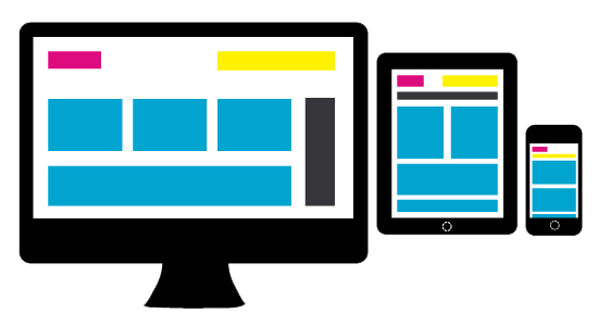
3. Media Query Readings
Media queries allow you to (a) detect to the type of device that is accessing your website, and (b) apply rules to the page that correspond to different screen dimensions. This allows you to create “responsive” web pages that can be tailored to different devices and screen sizes. To learn more about media queries, please refer to the following resources:
- required (skim) A complete guide to media queries
There are some additional samples / links relating to media queries on the course website.
Credits: Thank you to Yjaden Wood for sharing many of these CSS resources.
1. CSS Grid Activity
There are many different ways to use CSS grid to make a layout. In this tutorial, we will follow an approach that involves:
- Setting up columns and rows using the
grid-template-columnsandgrid-template-rowsproperties. - Naming the regions of your grid using the
grid-template-areasproperty. - Assigning different elements to different regions of your grid using the
grid-areaproperty. - Creating margins in your grid using the
grid-row-gapandgrid-column-gapproperties. - Scaling your columns flexibly using “fractional units” (fr). For more info on the
frunit, see the CSS units page.
For instance, the following code uses these properties to generate the layout pictured right:
Demo CodePen
See the Pen CSS Grid by Sarah (@vanwars) on CodePen.
Your Task
After downloading the lab files, please open the grid folder and implement the three layouts pictured below using CSS Grid. You should use the same stylesheet for all three views. Your TA will help you get started and walk you through one way of defining CSS Grids.
Hints
If you get stuck, feel free to take a look at the hints (see grid/hints folder). Try to do as much of it as you can on your own (better for learning), and only refer to the hints as needed.
- Hint 1 will show you how to layout the grid and assign the various containers to the grid areas that you defined.
- Hint 2 will show you how to set the background colors and center your child content horizontally and vertically.
- Hint 3 will show you how to set up your first media query for screens that are less than
900pxwide. See if you can do the “less than600px” screen by yourself.
2. Flexbox Activity
When you’re done with the grid activity, please open the flex folder and implement the layouts pictured below using Flexbox. You should use a single stylesheet to control all of the views.
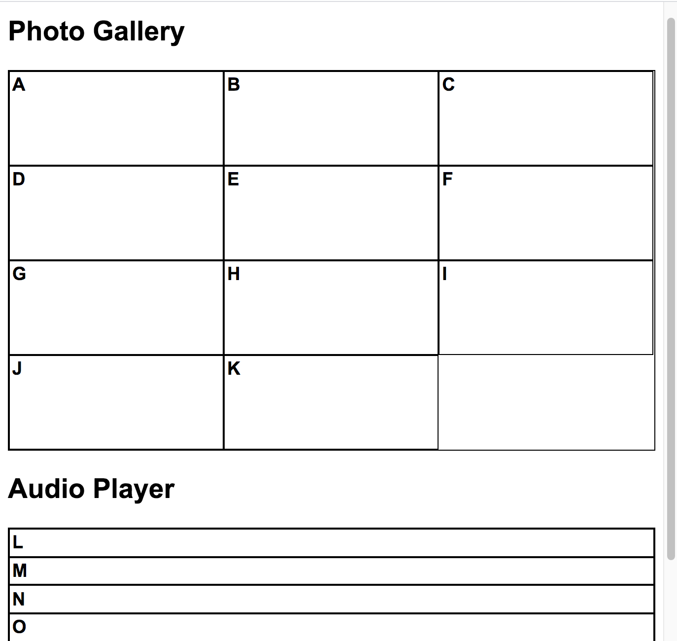
Photo Gallery
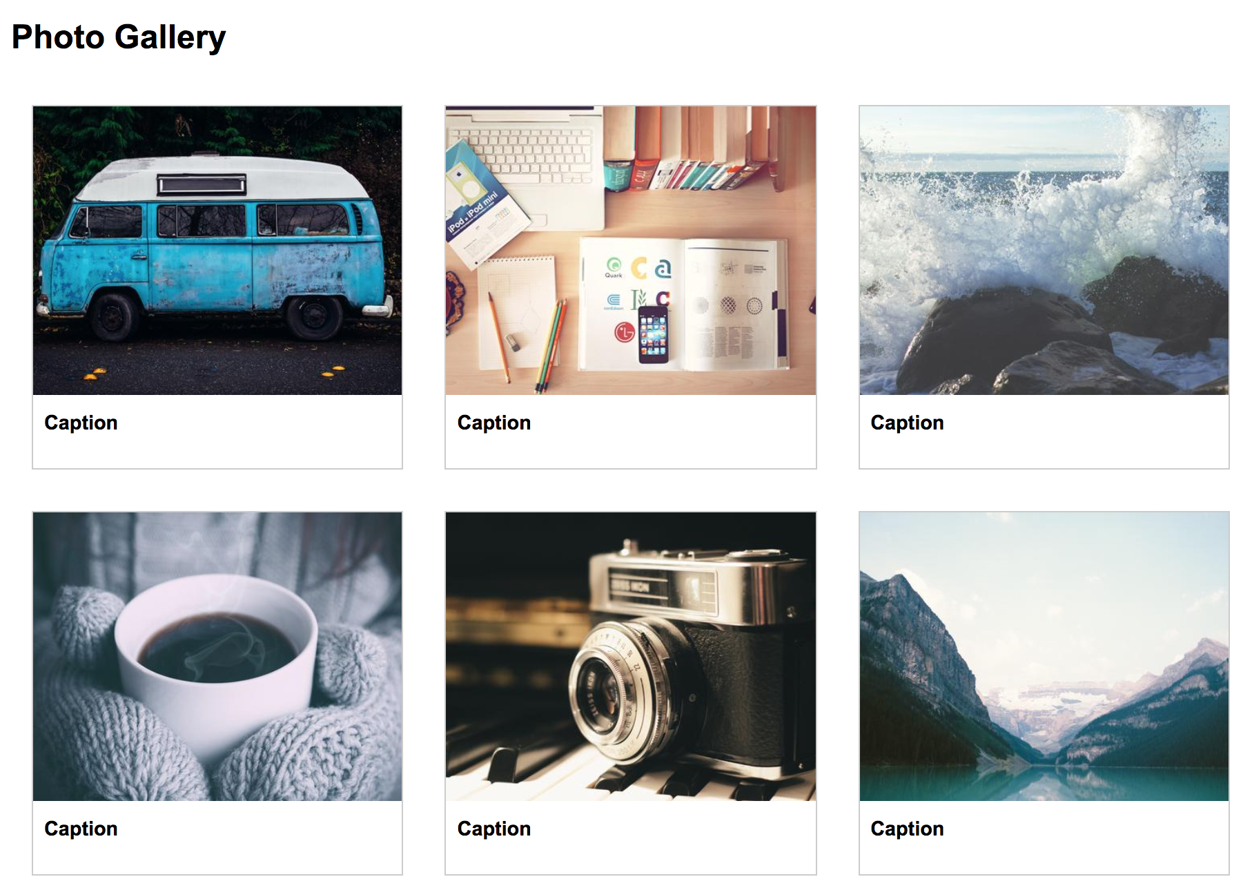
Desktop
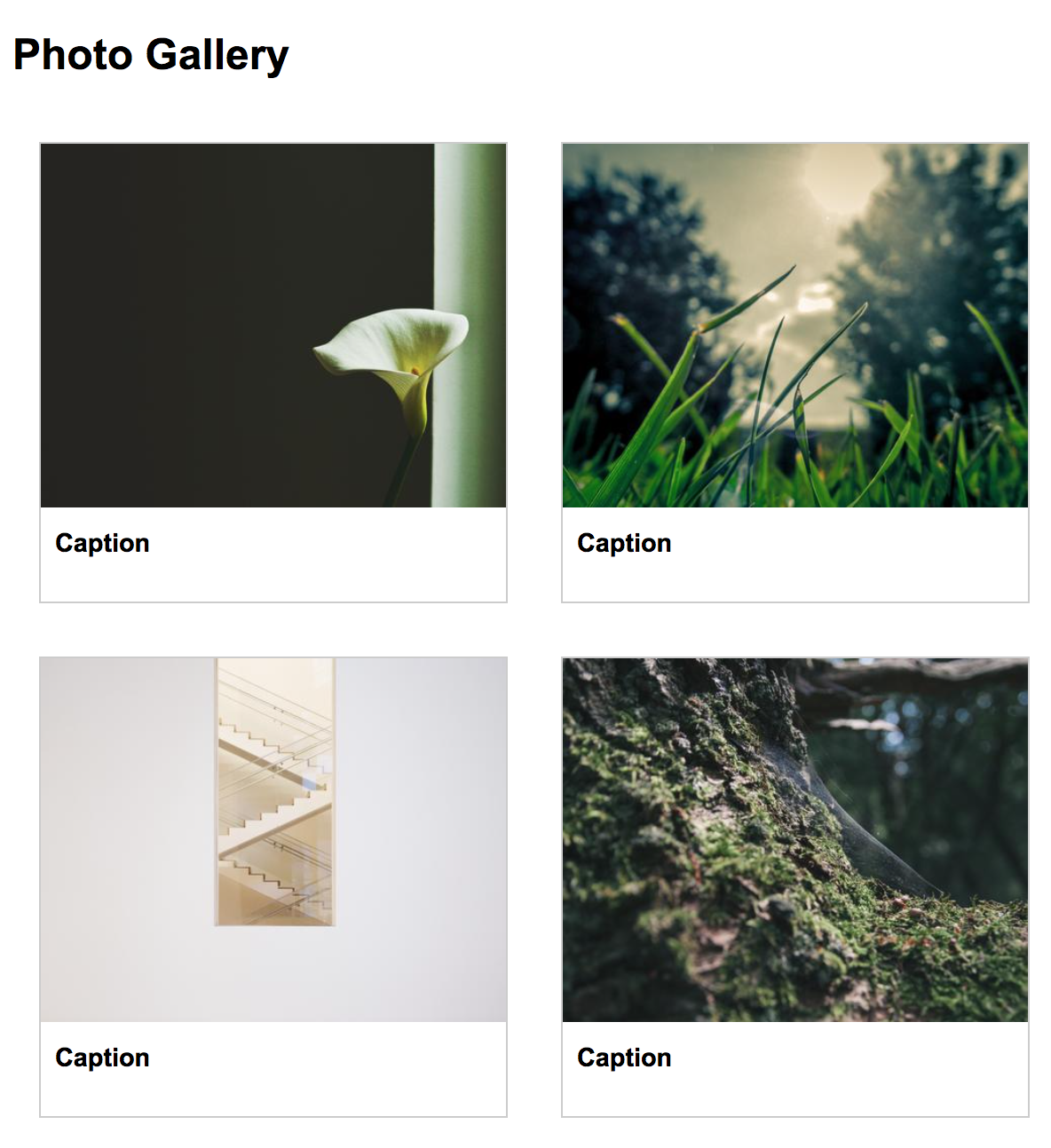
Tablet
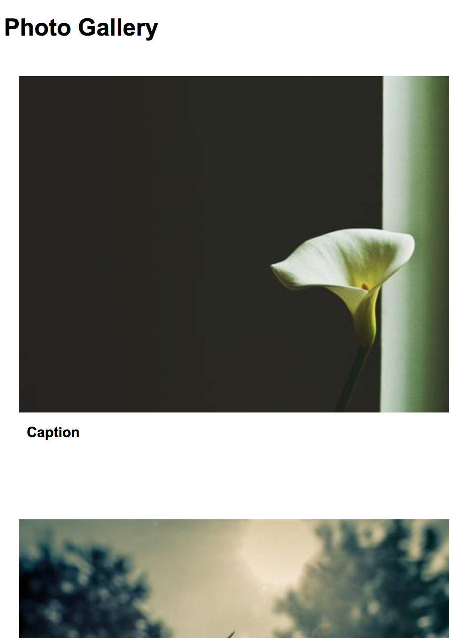
Mobile
Audio Playlist (Scroll to the bottom)
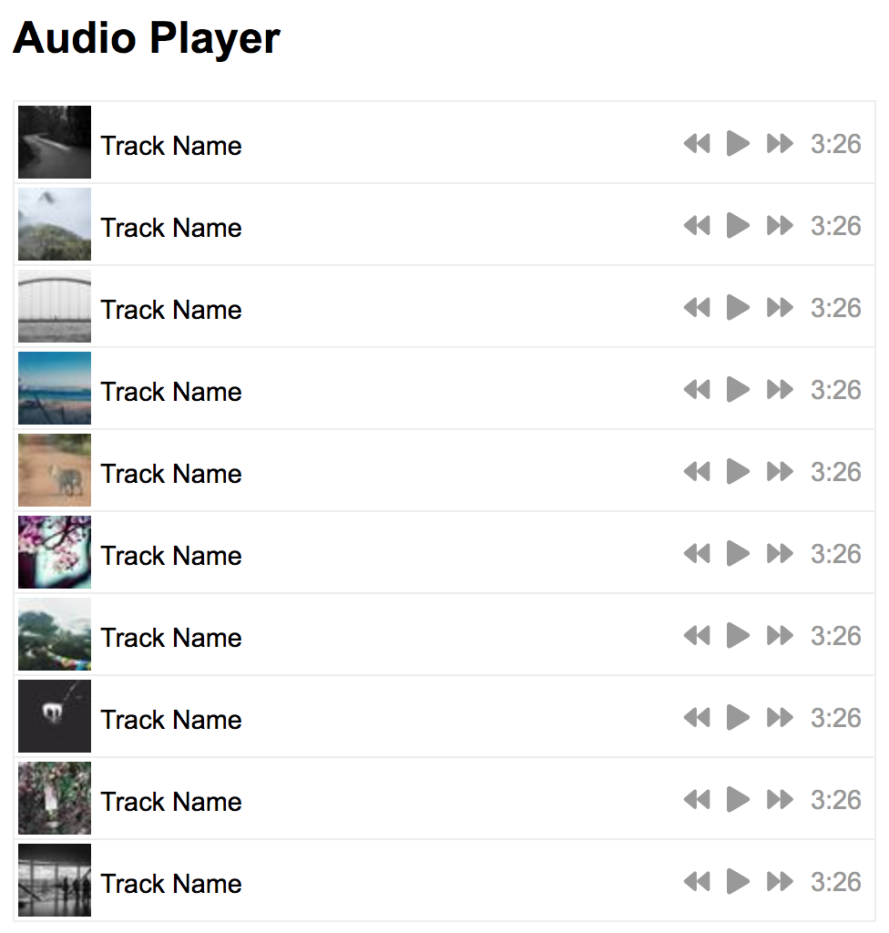
Desktop
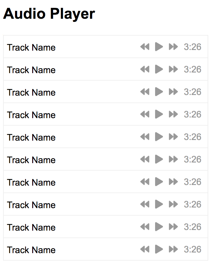
Mobile
Your Tasks
Follow the steps below. If you get stuck, feel free to take a look at the hints (see flex/hints folder). Try to do as much of it as you can on your own (better for learning), and only refer to the hints as needed.
Step 1. Set up flex containers
Assign .container-1 and .container-2 to display as “flex”, and see if you can recreate the layout shown below. See Hint 1 if you get stuck.
Step 2. Create and style the photo cards
In your index.html file, replace the letters A-K with the following:
<div>
    <img src="https://picsum.photos/460/360?num=1" />
    <p>Caption</p>
</div>
Feel free to replace ?num=1 with a unique number to force a different picture to load for each card. Next, open the style.css file and style each card. Give all of the img tags a width of 100% (so that they fill the container they’re in), and give the div tag a border and some margin. See Hint 2 if you get stuck.
Step 3. Create and style the audio playlist
In your index.html file, replace the letters L-V with the following:
<div>
    <img src="https://picsum.photos/40/40?num=1" />
    <p class="track-name">Track Name</p>
</div>
<div class="player">
    <i class="fas fa-backward"></i>
    <i class="fas fa-play"></i>
    <i class="fas fa-forward"></i>
    <span>3:26</span>
</div>
Feel free to replace ?num=1 with a unique number to force a different picture to load for each track. Next, open the style.css file and style each track. Try to align the player on the right and the image and track name on the left. See Hint 3 if you get stuck.
Step 4. Style for Tablet and Mobile
No hints this time! Just do your best. Criteria to hit:
- When the screen is between 500px-1000px wide, there should be 2 photos per column.
- When the screen is less than 500px wide:
- There should be 1 photo per column and no border
- The track image should be hidden
What to turn in
Please submit a zip file of your completed flex and grid folders. You’re welcome to include all of the hint files if it’s more convenient.